Game Keeper Documentary
Friday, 4 May 2012
Q3 Evaluation What have you learned from your audience feedback?
The first viewing was to an audience that we didn’t originally aim for, this was to get the opinions on the people that may just be flicking through channels. It was also a sample of people that we got to volunteer on the day of the viewing. However, we couldn’t get the correct audience that we originally aimed for on the day because of them all working on a day to day basis. even though this wasn’t the aimed audience - all of them being 16-19 years of age - we still received positive feedback, with constructive criticism, outlining what went well, and what needed to be improved. The majority of people said the footage was clear and simple to understand, along with concluding that the warning slide was appropriate for the topic, as they thought some people would have found the footage disturbing. However, the two main criticisms were an issue with the voiceover’s volume and the footage spent too long focused on Jim at the start while he was shooting. There is a negative side to using this sample, which is the younger generation of today do not tend to watch documentaries. Overall, the editing of the documentary was regarded as well done, too. The response given to the given knowledge of the profession was mixed, some people stated that they are now more informed on the subject, where as others believed the information given in the footage was not enough. If we were able to film a full documentary lasting approximately one hour, we would have placed more facts in the program, to better the audience’s knowledge and understanding. There was a group of 10 people obtained for the first viewing, who then filled out the questionnaire after seeing the documentary.
After
posting the documentary onto Facebook, the gamekeepers son got in
contact with me and said “my dad was wondering whether you'd be
able to put that video onto a disk for him?” he then told me that
the whole family had watched it and was very happy with the results.
We have also been asked to make several other disks of the
documentary as it is quite popular among them that were involved.
With this positive feedback we can assure ourselves it was a success
over all. This was very positive news as we had got the target
audience interested and they were happy with the results. We also got
back some more questionnaire’s back from other people that are also
our target audience. The results show that the video was clear to
understand throughout, and the footage was appropriate for the video
too, they also reported that there was no key issues with the video
either. However, they both commented in response that they hadn’t
learnt anything from the documentary because they were both from a
keeping background, one of the comments were “I know all about Game
keeping, my farther was a gamekeeper” this response could be a
common one due to people growing up in this environment, therefore
they would know all about it. I’m sure this happens a lot in other
documentaries such as traffic cops, a gypsy life, and other shows
where you are taken into someone else’s life. From this information
we should also take into consideration that we need to add more
complex commentary too as we don’t want the whole show to be for
armatures that are just interested in the contents, as the results
show that people that are involved in this sort of background also
are interested in watching it. It could be a factor that there aren’t
many documentaries that look into the life of a Gamekeeper, and there
for take the opportunity when it comes up. The other comments given
in were “wished it had been longer detailing the build up to the
shoot because the shoot is the last element in the gamekeeper
season.” this comment has supported our idea as we used this five
minute documentary to supply ourselves with what we needed for only
five minutes. We said that this episode would be one of many
different ones as each episode would involve a different season. So
that comment supports us in what we would have liked to have done, we
would have also like to have made it longer which was also comments
we got from our facebook feedback. We also asked in the
questionnaires if they would have changed anything if they could and
why, one of the responses were “ask the gamekeepers more
interesting questions” yet again if we were able to make the
documentary longer we could have added in more things like this for
example. We also asked “if the video was on telly as a program,
would you watch it?” many people in the first viewing said they
don’t either watch documentaries or not the kind that we had
covered. But in the second viewing it was a different case as some
results say “yes, because its interesting for people who do these
activates and for people who might start being a gamekeeper, they can
see what is done.”
Over
all for our second viewing at out target audience the results were a
lot more positive. The results show that we have managed to get the
attention of our target audience, and we have good feedback from
them, if we were to carry on and make a real go of making a
documentary that lasted possibly an hour and we followed with the
series idea having 6-7 episodes at different stages of the year, then
its possible that our target audience would be interested and watch
it. We would also be able to add in more interesting things and
“details” to it. I think that in the end we managed to achieve
what we set out to do.
EVALUATION Q4. How did you use media technologies in the construction and research, planning and evaluation stages? SS
A. Research and planning.
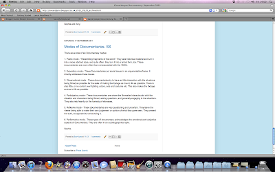 - We used the internet search engines to obtain similar product research. This gave us ideas of some things to use in our product, too. For example, panning shots and title slides. Further internet research gave us more in-depth knowledge on documentaries. For example, the six modes of documentary.
- After this, we collected ideas of what we would like to do with our documentary. We came up with three things we definitely wanted for the 5 minute clip. These were to use 'rel people', have a narrating voice over, and to keep to the simplistic style. For example, not using actors, staged events or enhancing editing techniques in the footage. We felt that including these guide lines, we were going to have the ability of creating a more realistic documentary.
- The main idea was to have the documentary about Game Keeping. The reason for this was because both Amy and myself come from very rural backgrounds. She is a Game keeper's granddaughter, and i am a Farmer's daughter. We decided to go to Game keeping after realizing how little coverage the profession had. We found that there were many Farming documentaries, but virtually none on Game keeping. This is what fueled the desire for a fly on the wall coverage documentary on the institution. We also decided that we would preffer to film on a Shooting day, because there is a bad press for the bloodsport of game shooting and felt that we aught to outline that if it was not for people shooting animals, they would have to be culled in the near future, despite the 'wrong morals'.
- After having the decision of the Institutional Documentary genre, both Amy and I went to work searching through YouTube and other internet sites, looking for other Institutional documentaries to use for similar product research. We found many, but a few stuck in our minds because of different aspects. For example, "Ice Road Truckers" and "Airport" both set the standard, and gave us ideas of our filming techniques which included using hand held camera, along with using cuts and fades to show the passage of time as well as creating the needed 'flow'.
- With the information and the similar product research, we were able to gain an a target audience. We made a set of questionnaires and took them home, giving them out to friends and family. along with a few co-workers of Amy's. The questionnaire had queries into a number if subjects, ranging from age and gender, to gender of presenters and what channels people normally watch documentaries on.
- We used NeoOffice to type out the survey, and asked both male and female participants to answer the survey so we could have a comparison between results.
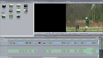 For the editing of the documentary, we used Final Cut Express. Amy stated, "It was hard at first, but once I got a idea of what to do, and how to work things, it got pretty easy". In addition, she also states, "The only other problem I had was when I was trying to relocating the interview to scatter it throughout the footage. The reason for this is was that I didn't understand, at first, how to synchronize the sound and the visuals without interrupting the background noise." This was resolved by finally learning to lock the sound and visuals so they don't affect each other in a negative way. After sorting out this problem, at some points of the footage, the sound had been altered. The reason for this, being that the sound was incomparable with the footage. Amy had to render the sound with 'cmd+R' command on the keyboard. This soon fixed the issue. From there on there was no more trouble with the editing process.
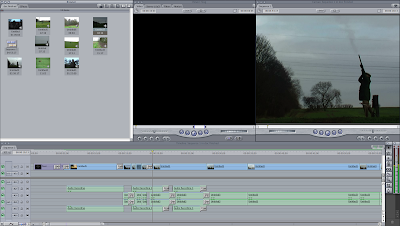 When the time came for burning the end result onto a disc, we encountered further troubles. These were that the file was now too big. This meant Amy had to turn it into an Iphone file. After this was done, we then uploaded the footage onto our Blog.
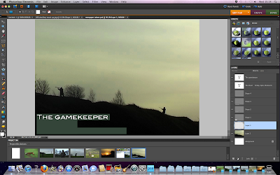 - I used Adobe for both ancillary tasks (The newspaper advert and the Double Page Spread). I found an ease of access when using this program. I am fairly familiar with it, from the work I did in the AS course, so I didn't have to get to grips with how it works.
 - We used the internet search engines to obtain similar product research. This gave us ideas of some things to use in our product, too. For example, panning shots and title slides. Further internet research gave us more in-depth knowledge on documentaries. For example, the six modes of documentary.
- After this, we collected ideas of what we would like to do with our documentary. We came up with three things we definitely wanted for the 5 minute clip. These were to use 'rel people', have a narrating voice over, and to keep to the simplistic style. For example, not using actors, staged events or enhancing editing techniques in the footage. We felt that including these guide lines, we were going to have the ability of creating a more realistic documentary.
- The main idea was to have the documentary about Game Keeping. The reason for this was because both Amy and myself come from very rural backgrounds. She is a Game keeper's granddaughter, and i am a Farmer's daughter. We decided to go to Game keeping after realizing how little coverage the profession had. We found that there were many Farming documentaries, but virtually none on Game keeping. This is what fueled the desire for a fly on the wall coverage documentary on the institution. We also decided that we would preffer to film on a Shooting day, because there is a bad press for the bloodsport of game shooting and felt that we aught to outline that if it was not for people shooting animals, they would have to be culled in the near future, despite the 'wrong morals'.
- After having the decision of the Institutional Documentary genre, both Amy and I went to work searching through YouTube and other internet sites, looking for other Institutional documentaries to use for similar product research. We found many, but a few stuck in our minds because of different aspects. For example, "Ice Road Truckers" and "Airport" both set the standard, and gave us ideas of our filming techniques which included using hand held camera, along with using cuts and fades to show the passage of time as well as creating the needed 'flow'.
- With the information and the similar product research, we were able to gain an a target audience. We made a set of questionnaires and took them home, giving them out to friends and family. along with a few co-workers of Amy's. The questionnaire had queries into a number if subjects, ranging from age and gender, to gender of presenters and what channels people normally watch documentaries on.
- We used NeoOffice to type out the survey, and asked both male and female participants to answer the survey so we could have a comparison between results.
- The next steps from this was to create an updated list of the equipment, and to post the changes to the interview type and to post the change to the channel which would air the show if it was ever made into a full-length program. These changes were due to the survey results being taken into consideration.
- We decided to draw up two sets of storyboards. The reason behind this is the possibility that a Shooting day would not arise. With Jim (The Game Keeper) having a hectic and unpredictable schedule, along with our collage timetables, there was a possibility that we wouldn't all be able to get together on a shooting day to film. In the end, however, we were able to get the shooting day arranged. With all this set out properly, we looked further into other documentaries, to make sure we weren't going to miss anything out in terms of technique. After using Google to search for any Game keeping documentaries, we found one named "The Shoot - The Keeper". This was perfect for us to take ideas from because it is on the same job as ours.
B. Construction.
When it came to the filming day, we ended up using two cameras and tripods, each had a spare battery, too. We thought it would be a good idea to have two cameras because one would be used for the hand held pars of the footage, whereas the other would be used with a tripod, to get the more steady shots. The cameras we used were Panasonic NV-GS75EB (A small, hand held video camera).
Editing of the footage.
 For the editing of the documentary, we used Final Cut Express. Amy stated, "It was hard at first, but once I got a idea of what to do, and how to work things, it got pretty easy". In addition, she also states, "The only other problem I had was when I was trying to relocating the interview to scatter it throughout the footage. The reason for this is was that I didn't understand, at first, how to synchronize the sound and the visuals without interrupting the background noise." This was resolved by finally learning to lock the sound and visuals so they don't affect each other in a negative way. After sorting out this problem, at some points of the footage, the sound had been altered. The reason for this, being that the sound was incomparable with the footage. Amy had to render the sound with 'cmd+R' command on the keyboard. This soon fixed the issue. From there on there was no more trouble with the editing process.
 When the time came for burning the end result onto a disc, we encountered further troubles. These were that the file was now too big. This meant Amy had to turn it into an Iphone file. After this was done, we then uploaded the footage onto our Blog.
Photoshop.
 - I used Adobe for both ancillary tasks (The newspaper advert and the Double Page Spread). I found an ease of access when using this program. I am fairly familiar with it, from the work I did in the AS course, so I didn't have to get to grips with how it works.
C. Evaluation
As there were only two people in this group, Amy and I decided to do two questions each, with help from each other, too. This was an effective way of dealing with things because it meant the process was quicker, and easier if one of us tackled two questions each. We both used the Blog entries as a reference when completing the evaluation. This was a good way of double checking our remembered facts. Each section of this evaluation is to be posted individually. The reason for this is the use of two Mac computers to hold our work. This method of posting also makes sure the order will be chronological.
EVALUATION. Q1. In what ways does your media product use, develop, or challenge forms and conventions of the real media products?
Our
product uses a range of different elements from existing
documentaries, we took the voice-over idea from “The shoot” we
used the voice from the interview to distribute over the video to
make it like a second voice-over. This then gave us both a male and
female voice-over, which can lead people to debate weather the
environment is for men and women, or if it is a male dominated job
still.
Using
final cut express I was allowed to select the parts of the audio and
take the recorded volume down, then adding my voice-over recording to
final cut express in the correct places where we wanted it to fit,
while also fitting best. This gave the effect of a clear voice-over
but not a silent background. With a silent background it didn’t
sound right when the voice over had finished and then suddenly there
was a burst on noise. Using this technique the end result with doing
the voiceover this way not only was suitable but also worked well and
went into the context of following the voice -over from many
documentaries, as they all had background noise too, however, there
was one documentary that I viewed on the television and this didn’t
have any background noise throughout the whole documentary, I thought
that this seemed very unprofessional and didn’t set a mood at all,
as the silence was the most distracting thing of all. Because of this
I decided that I would definitely have background noise as we didn’t
want the same effect as that specific documentary.
With
the nature of the video I had to take into account that some people
may not like the idea of birds being killed, so I therefore had to
display a warning clip at the beginning. I found that this wasn’t
too much of problem because it only needed to be simple text that
explained that some people may not like the footage. Messages like
this are used a lot in some documentaries that does follow blood
sports or violence. In all I don’t think this effects the video in
a negative way, but only in positive, because not only are we making
a documentary we also have to keep peoples feelings in mind as they
may be very much against the shoot.
We
used a basic opening clip of the title, I thought that the simplistic
look would add to the feel of the calm environment at the beginning
of the morning. With it to do with the countryside it would be
inappropriate to have a flash title that jumped out at you because it
doesn’t work well with the opening shot, the fade I used I think
worked well and because I used it all the way through I think it
worked even better because it doesn’t draw you away from the main
point that’s happening, it was also a simple to have a low key
change of shots without making it too over the top.
The
pan at the beginning was used to establish that its in the middle of
the country, shots like these are used to let people get a grasp of
what the landscape is really like. In this case the lack of shelter
can give people the idea that its not sheltered and there fore must
be cold. This then makes them a little sympathetic towards people
that have to work like that. However, that wasn’t the idea to do
that on purpose, we mainly wanted it to be an establishing shot and
add to the mood of the early morning with the sun rise.
Just
using these few points we have used techniques from other
documentaries to help our own. The cuts and the angles of shots were
also thought out from watching other documentaries like BBC Airport,
secret millionaire, traffic cops, and Billy Connolly route 66. Using
these for examples we were able to have a general idea to what shot
types to use for the documentary. I think through this we have kept
to the conventions of the other documentaries, apart from the woman
voice-over. However I think this was just a healthy change from each
documentary that seems to be dominated from men.
We
didn’t use direct documentary interviews like on Billy Connolly
route 66 where he talks to the camera like it’s a person. We
understand that he does this because he is his own presenter and
therefore needs to do this. However, our documentary was more from a
far, as if we were looking into the life from a distance.
To
develop our idea’s we went through different processes, this was
mostly due to the date being moved around for when we could film. At
the beginning we wanted to do a shoot day, however this was still
when we were planning the documentary. We then had to take into mind
that we were going to do an institutional documentary which then
meant we had to follow Jim throughout the day. We then planned it out
of what shots we were going to take and what he would do throughout
the day. However this was hard, because in the life of a game keeper
its hard to know what will happen due to split second things
happening which can then effect the rest of the day. We tried our
hardest to be able try and predict what could happen. The dates got
moved back 2 more times when Jim invited us to film the shoot. We
took him up on his offer but this meant that we had to change the
story boarding again, however this was difficult enough in itself as
its was still hard to predict what would happen. In the end we just
had to film what we could, and get all the key main events. When we
arrived we talked to the keeper about were we needed to be, after
explaining that we wanted to focus on the shoot he sent us with the
retrievers were we could get the best and safest shots of the shoot.
I think this helped develop our documentary the most as all the guns
and retrievers told us the best places to go to get the better shots.
This allowed us to get more footage as we had better angles to get
the birds flying over head. Because of this I think it gave the
documentary a good edge to it which I think made it better in the
over all task as it was easier to edit too.
Compared
to other documentaries this one has small quality’s as them such as
the shoot that we referred to on our blog. a lot of our research is
more along the lines of presenting to the audience where as ours was
more outside looking in. I think it worked in a lot of ways although
I think that if I had the chance I would like to film again and try
it with that technique to see how it would compare to the one we have
now. I think in that sense we have broken the boundaries a little bit
as there are less documentaries that have done it the same as we
have. The techniques we have used from them have been used effetely.
Wednesday, 2 May 2012
Evaluation- Question one, script AL, SS
Voice-over:
We
use the warning slide at the start, to outline the focus on blood
sport throughout the footage. This is one of the conventions used in
many documentaries which contain violence, abusive language,
delicate subjects and included scenes of inappropriate activity for
young audiences.
We
felt that, by using the panning-master shot, we created the rural
atmosphere, along with allowing the audience to view the surrounding
area.
The
same fade technique was used to create the professional look. This
also serves two purposes. The first is to create the flow between the
scenes and the second is to subtly cut scenes without drawing to much
attention to the technique used.
By
using a hand-held camera, we were able to get a good shot of the bird
falling to the floor after being shot. This simple cut brings a
divergence from the shooting, so not to bore the audience.
We
mostly followed Jim, at the start. The reason for this is because
there was more potential of a good series of shots from loading the
gun and waiting, to the actual shooting of the birds.
We
felt the position for the series of ‘Jim shoots’ was appropriate
because we got the trees, open space, and the gunman with his
equipment. The open space is a good thing to have because this is
where the birds take flight after being driven out by the beaters.
The
closer shots of Jim were done to get more of a feel of the aiming and
the shooting. This lets the audience see the impact the gun has on
the person holding it when it is fired. It also allows the viewers to
see the gunman aiming for the bird as it flies through the frame.
The
second cut to the failing bird was better, we felt, because it seems
to have more contact with Jim’s gun, rather than it being from
anyone’s firing range.
The
interview in the mid-point of the footage was used as a double voice
over. This aspect is a convention, however not in all documentaries.
For example, in the documentary, “Traffic Cops”, there is a
similar style of interview, were there is dialogue over footage of
past events. During the research stage, we took a liking to this
idea, and decided to add it in to our own work.
The
tilt acts as an establishing shot to give an idea of the different
drives, as opposed to staying in one place.
The
last drive reveals more shots of birds falling than all the other
drives. These shots lead to the dogs retrieving them and taking them
back to their handlers. This is a previously not as seen because we
wanted to focus the shooters more and the beaters interview.
To
finish the documentary off, we decided to film the Gamekeeper
speaking to the follow workers, allowing them to take home a brace of
birds, as a ‘thanks’ for their help.
We
used the close up of the birds because it shows the audience the
velocity of game. This panning shot also shows the audience what
happens to the birds after they have been shot.
The
last question of the interview was placed just before the end credits
to round the documentary to a close. We felt this is a simple, yet
effective way of ending the program. The joke of “It certainly
wouldn’t be jogging” creates a lighter tone in the interview. The
ending credits were simplistic, to keep in with the style of the
documentary as a whole. The accompanying music, we thought, creates
a relaxed and reflective mood for the audience on what they have
seen.
Wednesday, 18 April 2012
EVALUATION. Question 2 and 4. SS
How effective is the combination of you main product and ancillary tasks?
We chose Channel 4 to be the channel in which our documentary on Game Keeping would be aired. This is because we looked into the history of thier shows, and most of them are documentaries on real life situations, such as the police shows and the other institutional programs aired, too. For example, 'The Secret Millionaire' and 'My Dream Farm' are both institutional, following employees on their everyday life. Other channels in our consideration included Sky One and ITV3. Sky One aired, 'Inside Gatwick', a documentary which was alike to ours with following a person in their institution. ITV3 were shown to air similar programs, too.
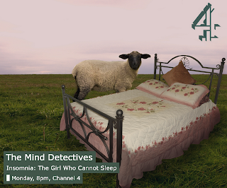 This is the kind of foundation needed to build the newspaper advertisement ancillary task on. To do this, I looked through Google Images pages to get examples of adverts to use as a reference. The conventions of a Channel 4 advert are few in number, so it was easily applicable to our own documentary on Game Keeping, because we use a simplistic style for it. For example, the adverts always have a set colour scheme that's appropriate for the show in question. For example, the advert for 'The Mind Detectives' is simplistic, with the colour scheme of green. The colour surrounding the text boxes is this earthy green, to go with the image of the sheep next to a bed in the middle of a field.
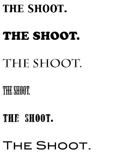
After looking through different adverts, I set about looking through fonts, to see which one looked better, and more professional. In the end, I settled on a font that was closest to the Channel 4 advert's font of 'The Mind Detectives'.
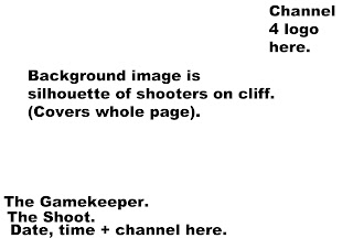 Next, came the mock-ups of the newspaper advert, which were just a series text of texts, telling us where to put everything.
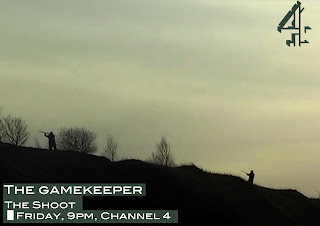
We kept to the style that Channel 4 is known for with a still image from the footage of the gunmen aiming, on a ledge in the quarry. The text and boxing are both as close as we could get to the professional adverts, with a darker green surrounding the white text. The Channel 4 logo is coloured in the same green as the boxes to keep within the colour scheme. The font for this was chosen to keep in with the style of both Channel 4 adverts, and the style of typical hunting magazines. We found that a lot of the DPS' in said magazines had this kind of font for their titles.
For our second ancillary task, we had to create a double page spread for a TV magazine. To do this, both Amy and I looked through well known TV magazines to find the type of double page spreads, so we could pick and choose which looked better.
We settled on one magazine to make the foundation, and I started outlining the page in a simple layout, using text labels and boxes. We felt this was a good starting point for the ancillary tasks.
After this was made, I delved into further research of typical double page spreads in TV magazines. I settled on one, and after speaking to Amy, we decided to base our task on this layout, as it seemed to fit in with the simplistic style of our newspaper advert more than the other ones we saw.
This required a change in the plan. This new mock up worked in our favor, because it allowed me to add still shots from the footage and to reflect on the research more. We found that there were more magazines with this kind of look to them, so we altered the mock up to look more professional. By this stage, the task started to look less amateur and more advanced.
Add in: The need to turn off the cameras to preserve battery, meaning that we missed some things, e.g. other birds flying, the Deer, people's reactions - insignificant, but we would have preferred to have them in, to include different things and to diverge from the mass of shooting shots etc.
We chose Channel 4 to be the channel in which our documentary on Game Keeping would be aired. This is because we looked into the history of thier shows, and most of them are documentaries on real life situations, such as the police shows and the other institutional programs aired, too. For example, 'The Secret Millionaire' and 'My Dream Farm' are both institutional, following employees on their everyday life. Other channels in our consideration included Sky One and ITV3. Sky One aired, 'Inside Gatwick', a documentary which was alike to ours with following a person in their institution. ITV3 were shown to air similar programs, too.
 This is the kind of foundation needed to build the newspaper advertisement ancillary task on. To do this, I looked through Google Images pages to get examples of adverts to use as a reference. The conventions of a Channel 4 advert are few in number, so it was easily applicable to our own documentary on Game Keeping, because we use a simplistic style for it. For example, the adverts always have a set colour scheme that's appropriate for the show in question. For example, the advert for 'The Mind Detectives' is simplistic, with the colour scheme of green. The colour surrounding the text boxes is this earthy green, to go with the image of the sheep next to a bed in the middle of a field.
After looking through different adverts, I set about looking through fonts, to see which one looked better, and more professional. In the end, I settled on a font that was closest to the Channel 4 advert's font of 'The Mind Detectives'.
 Next, came the mock-ups of the newspaper advert, which were just a series text of texts, telling us where to put everything.
We kept to the style that Channel 4 is known for with a still image from the footage of the gunmen aiming, on a ledge in the quarry. The text and boxing are both as close as we could get to the professional adverts, with a darker green surrounding the white text. The Channel 4 logo is coloured in the same green as the boxes to keep within the colour scheme. The font for this was chosen to keep in with the style of both Channel 4 adverts, and the style of typical hunting magazines. We found that a lot of the DPS' in said magazines had this kind of font for their titles.
For our second ancillary task, we had to create a double page spread for a TV magazine. To do this, both Amy and I looked through well known TV magazines to find the type of double page spreads, so we could pick and choose which looked better.
We settled on one magazine to make the foundation, and I started outlining the page in a simple layout, using text labels and boxes. We felt this was a good starting point for the ancillary tasks.
After this was made, I delved into further research of typical double page spreads in TV magazines. I settled on one, and after speaking to Amy, we decided to base our task on this layout, as it seemed to fit in with the simplistic style of our newspaper advert more than the other ones we saw.
This required a change in the plan. This new mock up worked in our favor, because it allowed me to add still shots from the footage and to reflect on the research more. We found that there were more magazines with this kind of look to them, so we altered the mock up to look more professional. By this stage, the task started to look less amateur and more advanced.
Add in: The need to turn off the cameras to preserve battery, meaning that we missed some things, e.g. other birds flying, the Deer, people's reactions - insignificant, but we would have preferred to have them in, to include different things and to diverge from the mass of shooting shots etc.
The documentary was all filmed in one
day due to time table restrictions from the gamekeeper along with the
ambition to keep the same effect as we only wanted to follow one day
of the shoot , this also worked because the different weather changes
would have been noticeable and the people there would have also
changed because each shooting day is different we also wouldn't have
been able to control the clothing of which they would have been
wearing, therefore we think that the one day shoot worked well as it
was as controlled as we could make it.
Wednesday, 14 March 2012
Ancillary tasks completed SS.
Both of our Ancillary tasks are now completed.
The newspaper advert:
This was done to imitate the style of Channel 4's adverts. To do this, we had to look at the overall style of each advert produce by the company, and see what the recurring themes were. We noticed that in all of the examples we saw, there was colour theme, along with the text being in blocks of colour, too. We tried to get the font as close to the Generic one that Channel 4 uses, too, to make our advert look as genuine as possible.
The DPS for a listings magazine:
This is our Double Page spread for a listings magazine. We tried to make it look as authentic as possible by imitating the layout of a popular TV magazine, along with the numbered images, and the Channel 4 logo too. The typical listings article has the larger font for the first letter of the text, so we decided to follow suit and imitate the text style, and layout of the typical listings magazine. We also added the yellow box with the genre, title, time and date. We felt that outlining this box with blue completes the page.
Sophie.
Subscribe to:
Comments (Atom)


